Few color pairings carry the depth of green and gold. Green brings saturation, calm, and structure. Gold introduces warmth, reflection, and contrast. Together, they create interiors that feel layered rather than loud and rich without being heavy.
While March often brings green and gold into the spotlight, this combination extends well beyond St. Patrick’s Day. From understated kitchens to statement powder rooms, green and gold backsplashes can read refined, dramatic, traditional, or modern depending on how they’re applied.
Below, we’ll explore five distinct approaches that show how green and gold tile ideas can feel tailored and timeless.
Deep Emerald Green: Moody & Architectural
The most direct way to use the palette is through saturated color. Saturated green has weight. It absorbs light, sharpens edges, and gives surfaces a defined presence. In smaller spaces, that depth tends to feel intimate and layered rather than overwhelming.
How emerald behaves depends largely on finish. Glossy surfaces reflect light, amplifying color variation and keeping darker tones from reading flat. Matte finishes absorb more light, creating a velvety, grounded surface that leans more architectural. Grout also shapes the final effect: tonal emerald or charcoal grout keeps the surface cohesive and continuous, while lighter grout highlights geometry and draws attention to the layout.
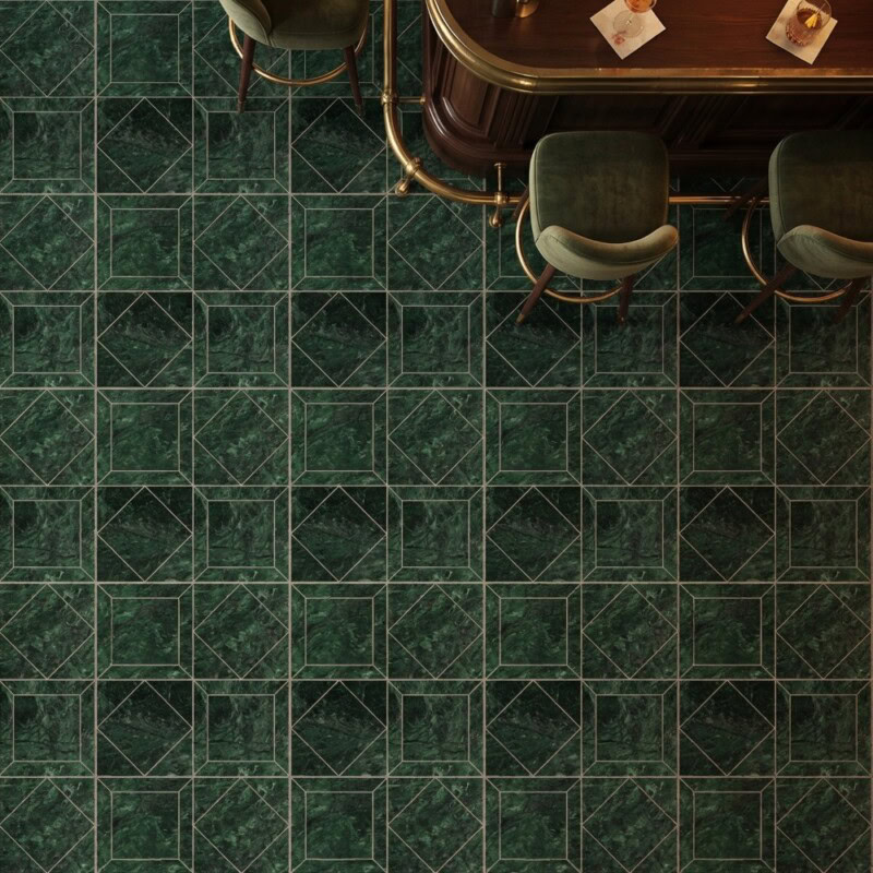
Marble Systems Verde Lucia Honed Palazzoli Essenza leans into the architectural side of emerald. The honed finish minimizes reflection while the geometric pattern adds structure and rhythm, making it perfect for statement backsplashes, powder room vanities, or feature wall panels where the tile becomes the focal point.
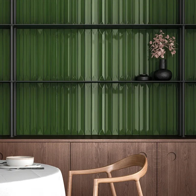
MIR Mosaic Flatiron Deco Forest creates a different effect. Its elongated vertical format draws the eye upward, introducing movement and a sense of height. This is especially effective in showers, bar backs, or narrow feature walls.
Together, these installations show how emerald tile can shift between structured and expressive depending on pattern, finish, and scale.
Green & Gold as Accents: Subtle & Tailored
For those hesitant to commit to a fully saturated palette, green and gold can appear in smaller, intentional ways. Accent strips within white tile fields, metallic trim edges, decorative borders, or niche detailing introduce color while keeping the overall surface restrained.
Even subtle decisions can shift the palette. Green grout within white tile changes the tone without introducing additional materials, while metallic edging trims create crisp transitions between surfaces and highlight the detailing.
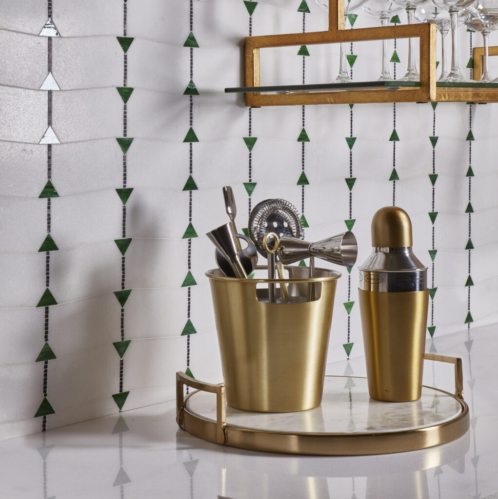
AKDO Essence Harmony Emerald uses a triangular motif to bring in geometric rhythm. Even when applied sparingly, like a vertical band or shower niche, it draws attention. The angular pattern reads contemporary and graphic, especially when placed in a neutral tile field.
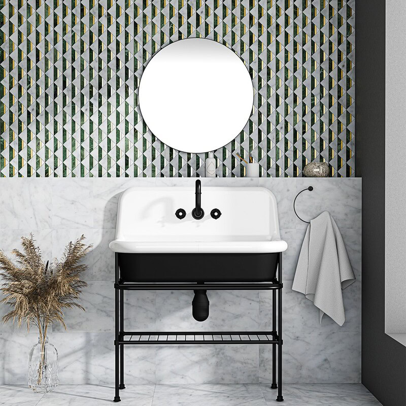
Marble Systems White Carrara Brass Verde Tia Angela combines white marble with green stone and brass inlay. Because the brass is integrated into the tile rather than added as trim, the effect feels precise and tailored. It works particularly well as a backsplash insert or decorative border where the craftsmanship becomes the highlight.
Small accents like these allow green and gold to introduce character while the surrounding surfaces remain calm and controlled.
Bold & Pattern-Forward: Eclectic Statements
Pattern adds another dimension to green and gold. Rather than relying on color alone, the layout of the tile begins to define the surface.
Scale plays a large role in how patterned tile reads. Smaller pieces create layered surfaces that reveal detail up close, while larger shapes produce a clearer graphic that can be understood from across the room. When working with expressive tile like this, surrounding materials typically remain restrained. Simple cabinetry, quiet countertops, and understated hardware allow the pattern to remain the focal point.
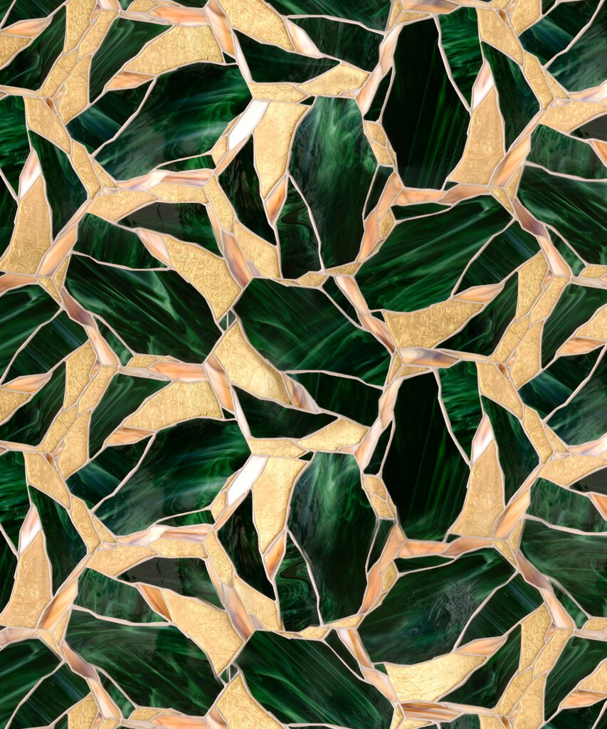
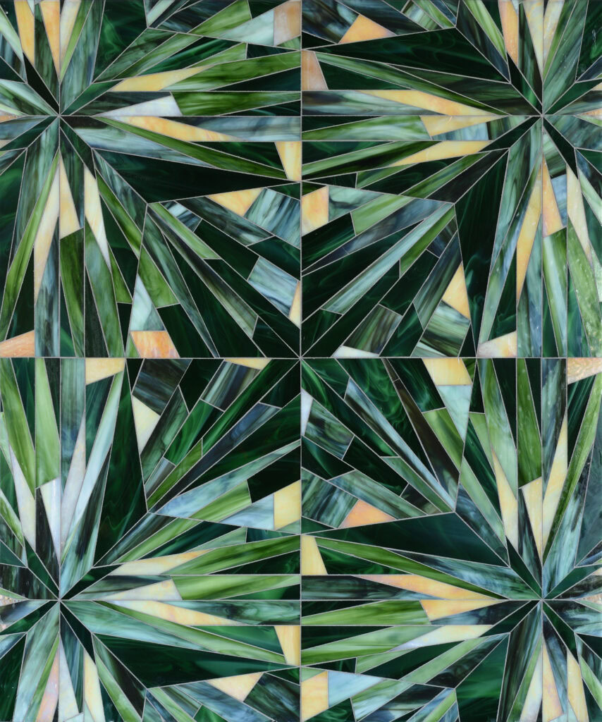
Mosaique Surface Wabi Sabi Petite Gem uses a tight, intricate layout. The smaller pieces create a surface that feels textured and layered without appearing busy from a distance. Up close, the tonal variation and individual shapes become more noticeable. From across the room, the installation reads as a rich field of color with subtle movement. It works especially well in powder rooms or bar areas where the tile can be viewed at close range.
Mosaique Surface Jewel Gem presents a more immediate graphic. The shapes are larger and easier to read, while the gold accents appear sharper and more defined. The pattern carries a slightly more structured feel, making it well-suited for statement backsplashes or inset backsplash panels.
The result is a surface where color and pattern work together, turning green and gold into the defining visual element of the space.
Traditional Motifs: Heritage Influence Reimagined
Some patterned tiles draw directly from historic architectural motifs. Interlocking knots, arabesques, and four-point floral forms appear throughout European and Celtic decorative work, valued for the way they repeat, connect, and create balanced surfaces. In tile installations today, those references tend to read less as symbolism and more as geometry.
These motifs tend to work best when treated as structured accents rather than full-room statements. Framed backsplash inserts, inset panels, or niche surrounds let the pattern stay visible without competing with surrounding surfaces
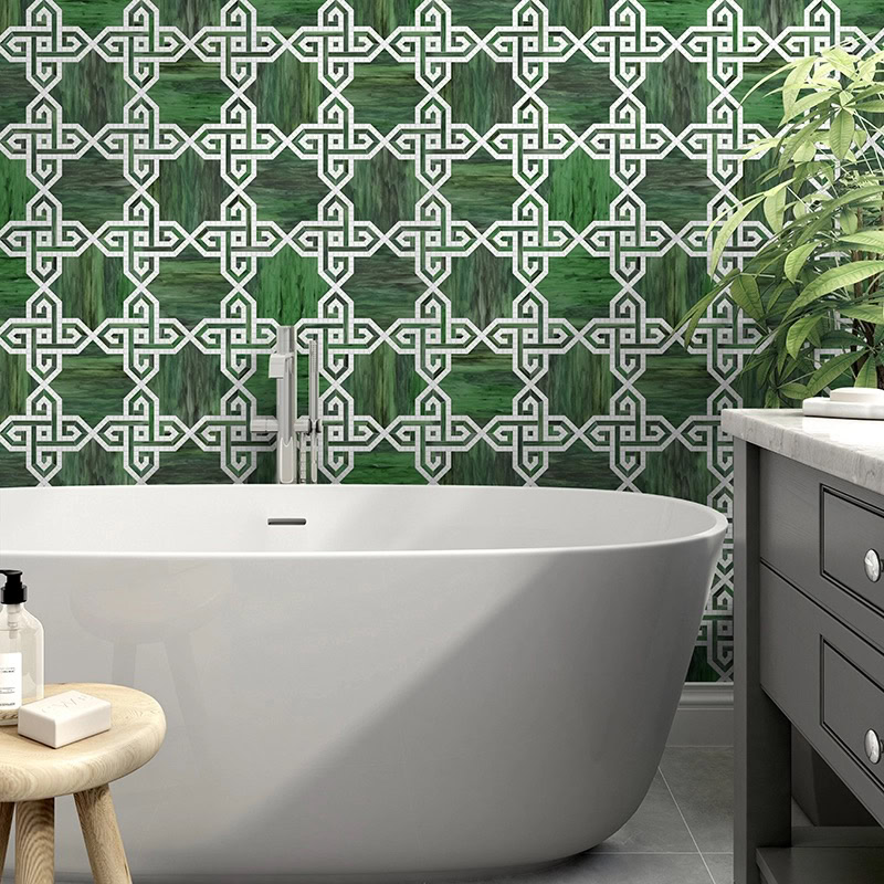
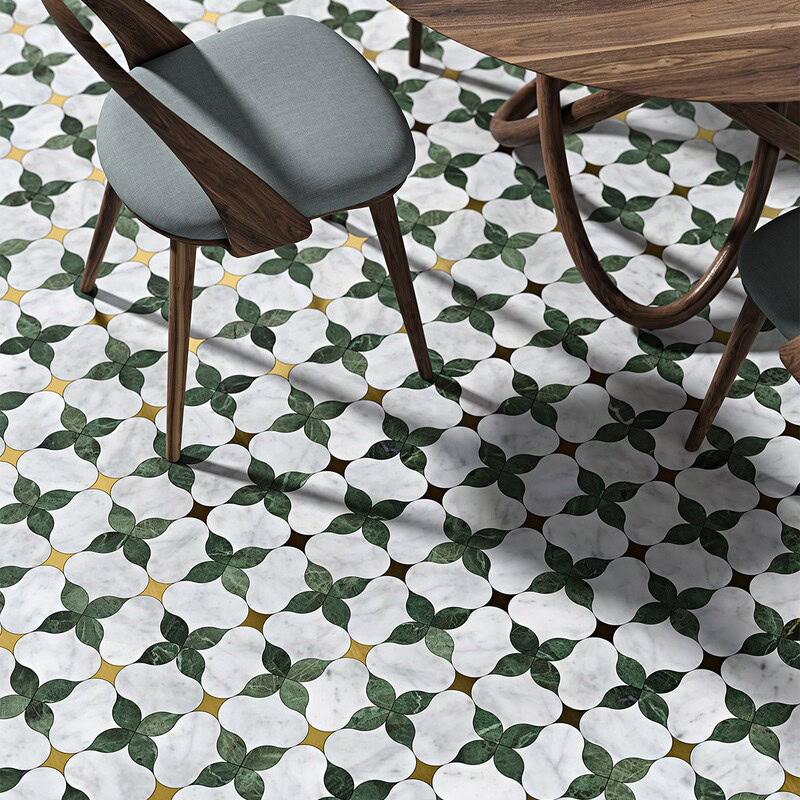
One interpretation emphasizes structure. Installations like MIR Mosaic Zarif Emerald use interlocking lines that echo traditional knot patterns, forming a continuous network across the wall. As the pattern repeats, the surface takes on a steady rhythm that feels architectural and disciplined, especially when carried across a full wall.
Other motifs soften that structure through curvature. Marble Systems Tia Honed Arabesque Mosaic draws from arabesque forms and scrolling leaf patterns found in historic tilework. The rounded geometry introduces soft movement while maintaining a clear repeating pattern. Green and gold accents follow the curves, letting the color flow naturally through the layout.
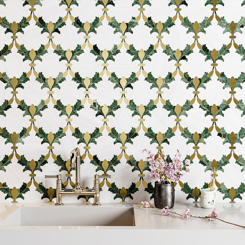
More detailed interpretations build on those traditions with added contrast. Marble Systems Tia Honed Lily Mosaic uses a four-point floral structure that recalls decorative motifs seen in cathedral stonework and heritage metalwork. Brass outlining sharpens each edge, defining patterns and emphasizing geometry.
Together, these motifs show how green and gold can bring historic pattern traditions into modern interiors without feeling trendy or trite.
Balancing Green Tile With Gold-Toned Wood
Once saturation and pattern are established, warmth becomes the balancing element.
Gold doesn’t always have to be metallic. Honey, caramel, and wheat-toned wood flooring introduce warmth that steadies saturated green backsplashes or feature walls, keeping the palette grounded rather than decorative.
In open floor plans, warm floors balance green tile backsplashes or accent walls by spreading that color intensity across a larger surface. In bathrooms, they soften emerald shower tile. In kitchens, they keep deeper greens from feeling too dense. Texture also influences how the warmth reads: light wire-brushed finishes add dimension without overwhelming the palette, while smoother surfaces feel more tailored and formal.
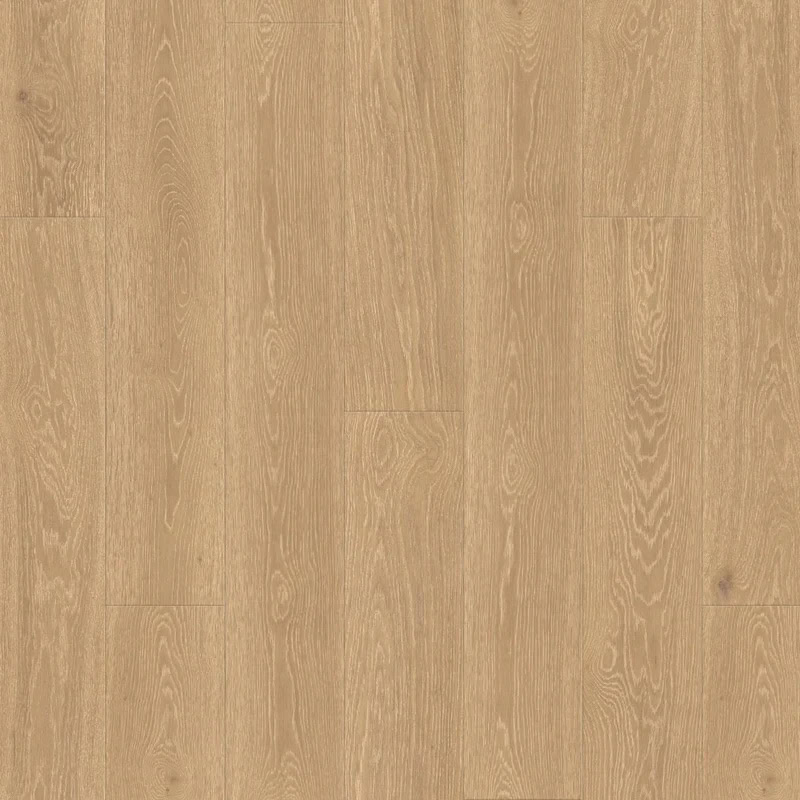
DuChateau Vernal Collina D’Oro features a golden oak tone with subtle grain variation. The warmth reads even and controlled, making it well suited for larger areas where consistency matters. Wide planks extend that effect, creating longer sightlines that help green walls feel integrated rather than isolated.
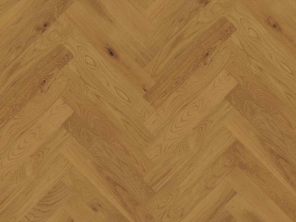
Monarch Lago Belviso Herringbone shifts the emphasis to layout. Installed in a herringbone pattern, the same warm tone gains movement and structure, making it effective in smaller rooms or defined zones.
Used intentionally, gold-toned wood brings in warmth while allowing deep green surfaces to remain the focal point.
Frequently Asked Questions
1. What should you consider when using dark green tile in low-light spaces?
Finish, lighting, grout, and scale all influence the way dark tile appears in low-light areas. Glossy tile reflects light and helps prevent heaviness, while matte tile deepens mood. Warm lighting (2700K–3000K) enhances richness. Cooler lighting can flatten tone. Larger tile formats feel more continuous; smaller tiles introduce movement and texture.
2. Are metallic-look gold tiles okay for wet areas?
It depends on the finish. Some metallic glazes perform like standard porcelain or ceramic. Others require more care. Always review water absorption ratings, slip resistance for floors, and manufacturer guidance on sealing and maintenance before installation.
3. What grout colors work best with green tile?
Matching grout creates cohesion and depth. Contrasting grout highlights shape and pattern. In high-traffic or wet areas, mid- to dark-tone grout is more forgiving than bright white. Always review samples alongside the tile before finalizing.
Create Tiled Treasures with Designer Floors of Houston
If you’re considering green and gold backsplash tile ideas, start by comparing tones and finishes in person. View samples together. Notice how lighting shifts saturation and how metallic or wood-toned elements interact with surrounding materials. Layering elements slowly turns a strong color pairing into a lasting design choice.
At Designer Floors of Houston, we help designers, contractors, and homeowners find tile and flooring that make palettes like green and gold feel intentional. Stop by our showroom to see these materials in person and compare finishes side by side, or reach out to our team to talk through your project.
Want more ideas? Browse our blog, explore our gallery, or sign up for our newsletter for ongoing inspiration and practical guidance on tile and flooring.